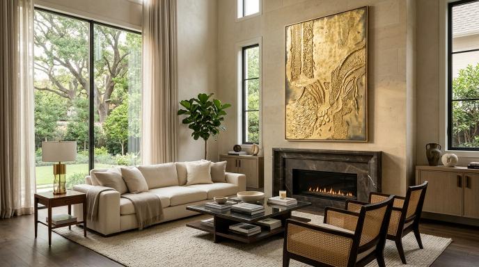
Luxury Wall Decoration: How to Create a Refined Look
What Makes Wall Decoration Look Refined?
Luxury wall decoration does not need a wall full of gold objects or an oversized painting in every room. A more considered result comes from scale, finish, colour, and the space around each piece.
Start by deciding what deserves attention. One well-chosen artwork often gives a room a clearer focal point than several unrelated decorative objects.
The aim is a room that feels carefully arranged and comfortable to use. Price alone cannot create that effect.
Get the Scale Right Before Choosing Details
A small artwork can look disconnected above a wide sofa, while an enormous piece may crowd a narrow wall. Compare the artwork with the furniture and the clear space around it.
Test a paper outline before ordering. If you are considering a set, measure it as one arrangement, including the gaps.
Example: Above a broad wooden sideboard, compare one horizontal textured piece with a pair of vertical artworks. Photograph both outlines from the doorway. Choose the layout that relates best to the sideboard and nearby features, rather than assuming the larger option is better.
Use Texture to Add Detail Without Clutter
A textured painting can bring visual interest to a restrained palette. Raised shapes and subtle tonal differences offer something to notice even when the colours stay close together.
Try cream, sand, or taupe artwork alongside wood and fabric. If the wall is also cream, check that the edges and surface remain visible. A frame or slightly deeper tone may give the piece the definition it needs.
A room can also benefit from a smooth painting. Choose texture because it suits the space and your taste, not because it is automatically a sign of quality.
Choose Metallic Accents Carefully
A little metallic detail can connect an artwork with a lamp, handle, or frame. Too many competing finishes may pull attention away from the art.
Decide whether your main metal tone is warm or cool, then check actual samples. Gold-coloured finishes vary widely, and two items described as “gold” may not look compatible together.
If the painting already contains metallic accents, a simpler frame may be enough.
Make Lighting Serve the Artwork
Check the piece in daylight and under your normal evening lights. Side lighting can reveal relief in textured work, but an overly strong light may create harsh shadows.
Avoid placing a light where it produces distracting glare or directs excessive heat toward the surface. Ask the maker about display conditions for the materials used.
You do not necessarily need a dedicated picture light. Sometimes adjusting the position of an existing lamp produces a more pleasing result.
Pay Attention to the Finish
Inspect the frame corners, edges, visible surface, and mounting arrangement. A refined display depends on these small details as much as the main design.
Ask for close-up photographs before ordering online. Confirm whether the product image shows the exact piece or a sample of a custom design.
When hanging, check alignment with the furniture below. Keep nearby cables and unnecessary tabletop clutter from competing with the artwork.
Know When to Stop
After hanging the main piece, live with the arrangement before adding more. You may find that the artwork and one supporting object are enough.
Leaving open wall around a painting gives the composition room to be seen. It also allows the room's materials and furniture to contribute to the overall look.
Plan a Textured Statement Piece
Explore SleekyOne if you want handcrafted texture art as the centre of your wall arrangement. Share the room colours, wall dimensions, and frame preference when discussing a piece. These details are more useful than asking for a general “luxury” look.