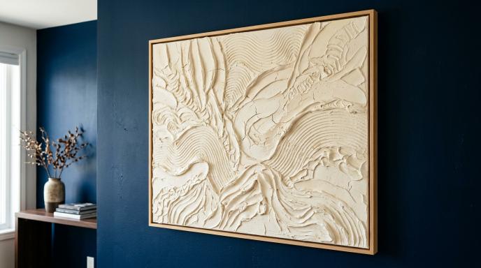
Wall Color Ideas for Texture Painting: 8 Palettes to Try
Choose the Wall Colour and Texture Painting Together
The best wall colour for a texture painting depends on the artwork's tones, frame, relief, and the light in your room. A cream painting can stand out against a deeper wall or blend gently into an off-white background.
This guide focuses on wall colours behind textured canvas art, with palette ideas you can also discuss when planning a textured feature wall. Test the actual paint and artwork colours before committing to a full wall.
Start with the effect you want: soft and quiet, warm and earthy, or clearly contrasted.
1. Warm White with Cream and Sand Art
Warm white can provide a gentle background for cream, beige, and sand-coloured textures. It is a useful direction when the room already contains light wood or woven materials.
Check that the painting does not disappear into the wall. Visible relief, a defined frame, or a slightly deeper colour within the artwork can help separate the two.
2. Greige with Ivory Botanical Texture
Greige sits between grey and beige, but individual paint shades vary. Pair it with ivory botanical art when you want a neutral arrangement with some tonal contrast.
View a sample next to the canvas. A greige with a cool undertone may look different beside a warm cream painting than it does on its own.
3. Muted Sage with Off-White Art
A muted sage wall can give pale textured artwork a soft colour background. Compare it with the room's curtains and upholstery before choosing the shade.
If the room already contains several greens, use a sample to check that the wall and textiles sit comfortably together. Matching by colour name alone is unreliable.
4. Pale Taupe with Cream and Bronze Details
Pale taupe can work as a restrained background for warm neutral texture art. Small bronze-coloured details may connect the painting with nearby furniture hardware or a lamp.
Keep the metallic accents limited if you want the texture to remain the main feature. Check how reflective details behave under evening lighting.
5. Dusty Blue with Ivory or Sand
Dusty blue offers more colour contrast with ivory or sand artwork while remaining less intense than a bright blue.
Try this direction if the room has blue textiles you want to connect with the wall. In a dim room, test carefully: the shade may appear deeper and cooler than expected.
6. Soft Terracotta with Simple Cream Art
A muted terracotta background can make cream artwork more prominent. Because the wall already contributes strong colour, a simple artwork may provide enough detail.
Compare the wall sample with the floor and furniture. Several different reddish wood tones and a terracotta wall may need a quieter connecting neutral elsewhere.
7. Charcoal with Pale Raised Texture
Charcoal can create a pronounced outline around a pale painting. It is an option when you want the artwork to be the clear focal point.
Try a large sample before painting. The combination may feel too strong for the atmosphere you want, particularly if the furniture and flooring are also dark.
8. Soft White with Colourful Textured Art
If the artwork contains several colours, a soft white background gives you fewer competing elements to coordinate. Pull one accent from the painting into a cushion or small accessory if you want a visible connection.
White paints also have undertones. Compare the sample with the lightest part of the artwork rather than assuming all whites will match.
Test the Palette Before Painting the Wall
- Place a sufficiently large paint sample at the intended location.
- Hold the artwork or an accurate material sample beside it if available.
- Check the combination in daylight and under your usual evening lights.
- Compare it with nearby furniture, flooring, and curtains.
- Decide whether the artwork has enough definition against the background.
Photos can help you compare arrangements, but they should not replace viewing actual colours in the room.
Find a Palette for Your Space
Explore SleekyOne for handcrafted texture art and discuss your preferred colours alongside the wall shade. Sharing both together makes it easier to plan a piece that fits the room.